In previous section, we studied about Percentile and Quartile, now we will be studying about Box Plots and Outlier Detection.
The pictorial way to find outliers is called Box Plot. Box Plots help us in outlier detection.
The box plot has got box inside them, therefore they are called box plot. A box plot contains 5 values: minimum value, 1st quartile value or lower quartile (LQ), the median, the 3rd quartile or upper quartile(UQ) and the maximum value.
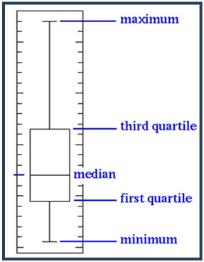
All the above together gives a box plot. The 1st and the 3rd quartile from the box in the box plot. If there are any outliers in the data, the value of the 3rd quartile, which covers the 75%, will be very small and the maximum value will be far away from the box. If the box plot is not looking like a line, but just like a line, then we can clearly identify the outliers.

From the above box plot, min. value is 5, 1st quartile is 10, which means 25% of the values are less than 10 and 75% of the values are more than 10. The 3rd quartile is 15, which means 755 of the values are less than 15 and only 25% of the values are more than 15. Now within the 25% of the remaining values, we can see the maximum value is going as high as 120. So this is a clear indication that there are outliers i.e., some values are very much different from the rest of the values. So when we can’t see a real box in the box plot, like in the figure below, where we can just see a line. In fact it contains a box which consists of 75% of the values and the remaining dots are just the 25% .
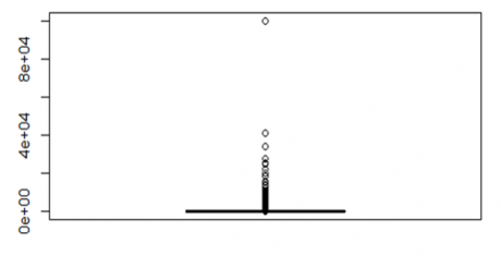
Since the outliers are so much impacting the box plot, we are not able to see the box.
Box Plot and Outlier Detection in R
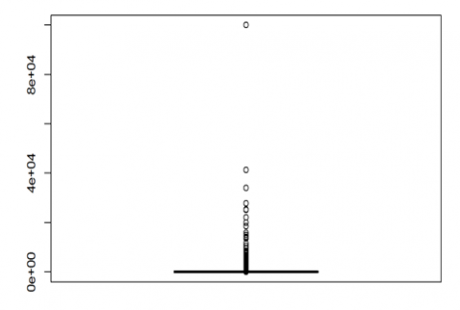
Box plot is one of the easiest ways to find the outliers. Now let us see if there are any outliers in the variable “capital.gain”, of the dataset, “usa_income”.
>boxplot(usa_income$capital.gain)
From the above box plot, the horizontal line at the bottom is the box i.e., the box is squeezed into that line, as it contains 75% of the population. The remain population is only 25%, so definitely there are outliers . Now let us see the box plot for the variable “education.num”.
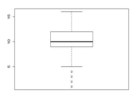
Now in the above box plot, the box is clearly visible and the data is evenly distributed. Hence we can say that there are no outliers in this variable. We can also verify this by taking the summary or the quartile values. So whenever we see that the box is squeezed into a horizontal line, or the box is very much away from the maximum value, then we can conclude that there are outliers in the data.
LAB
Here again consider the “bank_market” data from the Bank Marketing folder.
>bank_market<-read.csv("C:\\Amrita\\Datavedi\\Bank Marketing\\bank_market.csv")
Let us draw a box plot for the variable “balance”, get relevant percentiles and see the distribution.
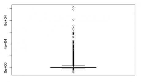
>boxplot(bank_market$balance)
From the above box plot, the box is totally squeezed into a line and we can see outliers on both the ends i.e., outliers on the high side and low side, as there are some values which are realy high and some value are really low. Let us see the percentile and quartile:
>quantile(bank_market$balance, c(0, 0.1, 0.2, 0.3, 0.4, 0.5, 0.6, 0.7, 0.8, 0.9, 1))
##  0%   10%  20%  30%   40%   50%  60%   70%   80%   90%  100%
##-8019   0   22   131   272   448  701   1126  1859  3574 102127
The same conclusion can be obtained from above result, that there are outliers present at the extreme ends. Now let us see for the variable “age”.
>boxplot(bank_market$age)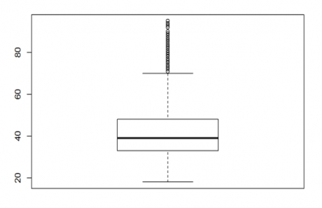
From the above result, we can see the box in the box plot, and the maximum value is not that far from the box. From the above box plot, we can see that R is suggesting us with the outliers but that cannot be always true as we saw earlier. We have to analyze that. Let see the percentile and guartile values
>quantile(bank_market$age, c(0, 0.1, 0.2, 0.3, 0.4, 0.5, 0.6, 0.7, 0.8, 0.9, 1))
##   0%  10%  20%  30%  40%  50%  60%  70%  80%  90% 100%
##   18   29   32   34   36   39   42   46   51   56   95
From the above result as well, we have a similar conclusion, that there is little chance of outliers being present in the data. But comparing with balance, age has lesser outliers.
Creating Graphs
Creating graph is very simple.We just take a dataset and apply the graph function to it. Let’s consider the dataset “cars” which is already there in R. It contains 2 variables “speed” and “dist”. Let us plot a graph with these two variables.
>cars
>plot(cars$speed, cars$dist)
We get a graph or the scatter plot for the two variables. Speed is on the x-axis and distance is on the y-axis. As the speed increases, the stopping distance will also increase. Now let us draw the graph for the data “sporting_goods_sales”.
>Sporting_goods_sales<-read.csv("C:\\Amrita\\Datavedi\\Sporting_goods_sales\\Sporting_goods_sales.csv")
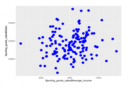
The scatter plot should be for the variables, “Average-Income” and “sales”. Also see if there is any relation between the variables.
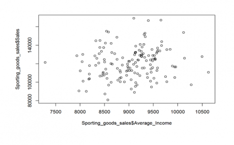
>plot(Sporting_goods_sales$Average_Income, Sporting_goods_sales$Sales)
From the above scatter plot, both the variables don’t seem to have any pattern or relation between them. When the Average_Income increases, sales might or might not increase. Now let see if there is any realtion between “Under35_Population_pect “ and “sales”.
>plot(Sporting_goods_sales$Under35_Population_pect, Sporting_goods_sales$Sales)
In the above scatter plot, we can see some relation between the two variables. We can say, as the under 35 population increases, the sales increases i.e., the sales of the company increases, as the people under 35 or the youth are more, say in a particular city.
BAR CHART
Bar chart is a type of graph mostly used to see the frequencies or the count. Lets consider the dataset “mtcars”. What we want to see is the count of cars with the number of cylinders. So first we create a table for that.
>bar_table<-table(mtcars$cyl)
And then we plot a bar chart for it.
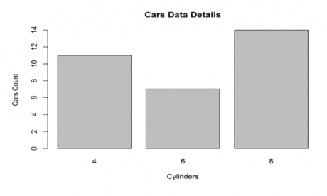
>barplot(bar_table, main="Cars Data Details", xlab="Cylinders", ylab="Cars Count")
So we can see that there are some cars with 4 cylinders, some with 6 cylinders and some with 8 cylinders. Number of cars with 8 cylinder is the maximum. So a bar chart can be prepared for any distinct variable. But for that we first have to plot the bar_table, then the barplot.
>bar_table
# 4  6  8
# 11 7 14
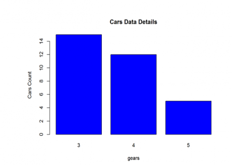
Now let us plot a bar chart for the variable “gears”.
>bar_table_gear<-table(mtcars$gear)

>barplot(bar_table_gear, main="Cars Data Details",   xlab="gears", ylab="Cars Count" , col=4)
>bar_table_gear
# 3  4  5
# 15 12 5
So from the above results, we can see that, there are 15, 12 and 5 cars with 3 gears, 4 gears and 5 gears respectively. So maximum cars are having 3 gears.
LAB
Lets consider the same dataset used for the scatter plot,”Sporting_goods_sales”.
>Sporting_goods_sales<-read.csv("C:\\Amrita\\Datavedi\\Sporting_goods_sales\\Sporting_goods_sales.csv")
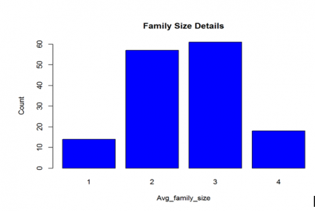
Now let us plot the bar chart for the variable “family_size”.
>table_family.size<-table(Sporting_goods_sales$Avg_family_size)
>table_family.size
#1  2  3  4
#14 57 61 18
>barplot(table_family.size, main="Family Size Details", xlab="Avg_family_size", ylab="Count" , col=4)
So the above bar chart is for the family size, which say that count for family size 3 is the maximum and with family size 1 is the least. We can put labels, apply colors and lot more to the bar chart.
Trend chart
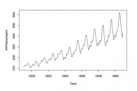
When the data isforthe time series, we make use of the trend chart. Let us consider the airpassenger data. It is a monthly air passenger count data from 1949-1960. Let us draw the trend graph for it.
>plot(AirPassengers)
From this we can see the pattern for the number of people travelled from 1949-1960. We can also see that there is an increase in the number of passengers every year.
So using trend chart we can plot the future forecast as well.
LAB
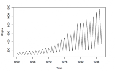
Let’s do an exercise on the on the UKgas data which is already there in R
>plot(UKgas)
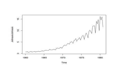
So here we can see that over a period of time, both volume and seasonality increases . Now let us plot the trend chart for the dataset JohnsonJohnson, which tells the earnings for the JohnsonJohnson shares.
>plot(JohnsonJohnson)
So from the graph we can see that they did really well over the period of time.
Ggplot
There are some more ways of customizing the graphs. The graphs we saw till now are very basic graphs. R is known for its graphics abilities. There are dedicated packages in R for better visualization. One of the pakages is “ggplot”. Let’s see the same example, cars. We can plot the graph for speed and distance.
>library(ggplot2)
>qplot(speed, dist, data=cars, colour=I("red"), size=I(5))
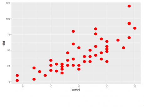
So from the above plot, we can see that the graph looks more appealing than earlier Let us consider some more examples.
Scatter plot between Average_Income and Sales
Scatter plot between Under35_Population_pect and Sales.
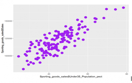
It’s the same graph, but using this package makes the graph more beautiful. We can customize it as we want with different colors, shapes, etc. There many such packages in R. So when we use real data, it’s always better to use these packages instead of using simple graphs.
So in this session we discussed some of the basic statistics like mean, median, variance, standard deviation, etc. We saw how to find outliers which is very important. Then we saw the distribution of data using percentile and quartile. OX[After that we saw different types of graphs , like scatter plot, bar chart, trend graph, ggplot.


